Butter pats
Humble things attract my attention, especially if well lit.
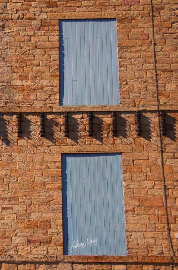
This slanting sunlight gently picked out the detail of these wooden butter pats on a whitewashed wall at Erddig in Wales.
The level of detail is especially pleasing as all the light and dark tones have reproduced nicely in this picture.
It radiates a kind of timeless calm for me. I could come back on another summer day in a hundred years and still find the same scene.
Kickabout
As you’ll have gathered by now I’m interested in how far I can push a picture and still have you recognise the human form.
Here is my latest offering:
Another way of looking at this was expressed by a friend “Why on earth did you buy a camera that can capture tens of millions of pixels only to take blurry snaps like a box brownie?!”
You’ll have probably guessed that to take shots like this you need a lot of control over the camera, to override its programming to take the sharpest pictures….. just like everyone else.
I like making the effort to be a little different.
Creating a sense of calm
The calm is created by the rhythm of the repeating lines of the lime trees in this picture. The repetition is reassuring the more we look at the image.
I took a variant of this shot with some people walking down the aisle. I found they altered the sense of calm. so I chose this photograph to share with you. The mind can wander more when people are absent from a Landscape.
There are no threats to us here, it feels as though you could walk into the picture and explore the avenue in complete safety. The protective canopy of the trees reinforces this subliminal feeling of care and safety.
Composing for Emotions
Emotions are tricky things. It is so easy to get it wrong and strike a discordant note.
All photographs evoke an emotional response at some level.
In my experience pictures with powerful emotional content are rarely manufactured, and tend to be found.
I found this composition – I’m interested in what you think:
People I’ve shown this to have reacted in the same way, it seems to pull at the heartstrings.
The composition is quite simple using framing and a central theme that compliments the portrait format.
The blurred nature of the picture seems appropriate too.
If you are affected by this picture I can offer reassurance if you leave a comment.
Content Contrast
Having too much of one theme in a photograph can sometimes be ok but is ok good enough?
Try introducing a contrast of content as well as colour in a picture and you can improve the composition and make it more interesting.
In this first picture you’ll see the contrast between the door, the bottle and the brush, boldly human artefacts. the flowers in the pots add a splash of contrasting colour as well as a natural touch.
I shot these photographs a few days ago at Parceval Hall in Wharfedale in the Yorkshire Dales. A lovely place.
In the comparison picture I moved a little to the right
Can you see how the brush is now a distraction and not part of the composition.
The overall effect is nice , partly because your attention is brought more explicitly to the reducing height of the pots that echo the steps on the left of the photograph but I prefer the first picture as there is more interest. The bottle brush and door bring the human presence into the imagination, I wonder who lives there?
Mixed verticals and strong lead in lines
See what you make of this one.
The first thing you notice is the shape of the trees emphasised by the repeating pattern
Then the strong lead in lines capture the eye.
Composing without the Golden Section (2)
This photograph does not follow many of the conventional rules. It is asymmetric and not composed with the golden section.
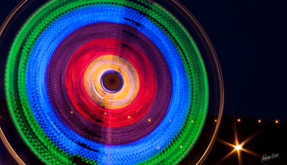
It works for me though. The colours make this picture and the starburst highlights make it look like a picture that NASA’s hubble telescope might have taken.
It is more earthly, but quite what is difficult to tell. this underlying mystery holds the attention after the bright colours have done their work.
Urban Landscapes and the Golden Section
The Golden Section is a design idea that has been around for at least two thousand years and its purpose is to make a composition more pleasing to the eye.
Roughly speaking if you divide up a picture into thirds then things of interest are more appealing if they are placed on one of these lines and special points of interest are where horizontal and vertical lines cross.
I took this picture a few days ago, and liked it enough to put it in the blog.
I liked the picture but wasn’t sure what was behind this instinct.
I thought it compositionless (that is to say not conforming to any rules) However when I looked more closely I realised that it was based on the golden section.
I have put the section lines in the picture below so you can see what I mean.
For comparison I took a similar picture with the doors set centrally:
Placing the interest centrally doesn’t work as well as being placed on the section line.
Isolating elements in a landscape
Again comparing two similar images
It struck me there was a better picture trying to get out of this one.
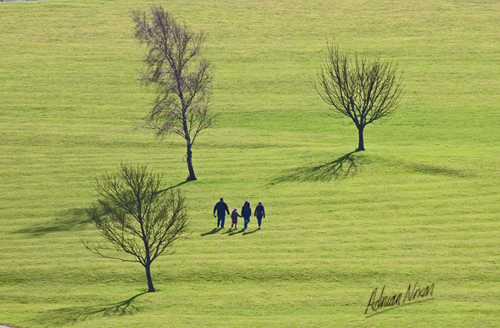
The isolated image concentrates the attention on the four figures walking through the three trees which makes for a better composition as there is less to distract the eye.
Note that there is no horizon in either picture, this composition doesn’t need one.
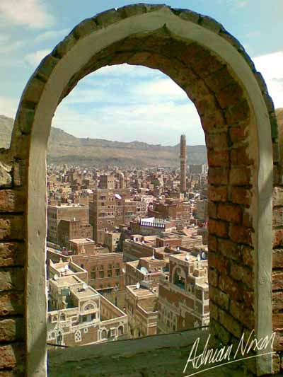
View of Sana’a in Yemen framed by an arch
The urban landscape presents lots of opportunities to frame photographs.
The rooftops in Sana’a in Yemen offer many opportunities to view the historic city.
So why frame the picture?
- Without the frame there is an open sky which was unremarkable
- This would make just another cityscape
- Using the frame adds interest in itself
- The frame also concentrates the attention on the details within the arch
Holding the viewer’s attention:
- This frame holds the attention of the viewer because you, the viewer notice the details in the arch.
- The arch contains the same materials as the buildings in the distance
- This creates a connection between the two, drawing you in, making you look closer, noticing the details of the buildings
- The distant objects are brought closer, this is why the picture works
You can find out more about sana’a from wikipedia
A different approach to framing a picture
Framing a picture is a common compositional device.
Framing places a boundary within the limits of the picture and controls the attention of the viewer.
Normally one would use an arch, doorway or a pair of trees, in the picture below I have chosen the reflective surface of the ball to contain a picture with the photograph and this makes you, the viewer look harder to try to make sense of what you see.
The urban landscape lends itself to this type of shot.
Notice the horizon is deliberately excluded from the background. The horizon is contained within the framed image so the background needs to be kept simple.
Composing with limited palette and colours
The limited colours made this picture attractive to me. Just the white of the snow and the shadows are blue light reflected from a clear winter sky.
The photograph has an abstract quality, it is very difficult to know what part of the landscape this is. The composition is very simple too. the repeating horizontal lines are the first thing the viewer notices and this gives the sense of calm.
The viewer then notices the detail within the horizontal elements, there are lots of complex shapes within this seemingly simple picture. Looking closer you will see lots of snowflakes. This is not the snow as it fell but is caused by partial melting and recrystallisation of snow over several days in very cold, dry conditions.
Creating a sense of unease with Rhythm
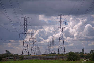
This picture is a different kind of landscape photograph, verging on the industrial.
The unsettling nature of the image is partly due to the subject. Electricity pylons are intimidating structures in the own right. The composition adds to the feeling of unease.
The reason I chose this particular composition was to take advantage of the repeating rhythm of the structures. The vanishing point is kept central and within the frame. This emphasises the origin of the pylons giving an impression of indefatigable progress. As the viewer looks at the photograph this vanishing point commands the attention leading into the unfathomable distance. The low horizon emphasises the sky which was deliberately chosen to be dramatic.
Then you notice the cables stretching towards you beyond the edge of the frame and you, the viewer unconsciously become aware that there must be more pylons to the left and right behind you. This is what creates the unease, the almost subliminal impression that there is something out of your field of view but nonetheless perceived.
Composing with Colour Harmony
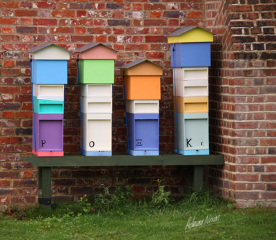
I noticed these beehives at Hartwell House and felt an instant attraction.
The gentle shades of colour of the hives compliment the rich texture of the background of the brick wall.
This was a day when I set out not really expecting to capture a good picture, it was overcast, a bit dull and raining. These lighting conditions suit this subject perfectly bringing out the textures and letting the colours do the work.
Some people recommend using an odd number of elements in any composition. I would challenge that view. The even number of elements (4 hives) seems to work quite well for me, what do you as the viewer think, please leave a comment to tell me.
Creating calm with Rhythm and Harmony
Colour harmony As a photographer I have a strong interest in colours and patterns in the image, and the way we perceive them.
Many people have told me that this photograph conveys a sense of calm:
There are several reasons why this is calm and restful, here are the main ones:
- Harmonious Colours: Greens yellows and greys complement one another and not contrast
- Even Lighting: Taking the photograph when the sun was clouded over reduced the tonal range in the picture (compare this with the selective lighting post in this blog)selective lighting post
- Rhythm: The repeating shapes of the trees create a sense of rhythm that is calm and reassuring. The reason is that we know what to expect next.
- Mystery: Look at the way the trees recede into the distance, it gets lighter and not darker, I wonder why… Where is the vanishing point in this picture?… The eye is led out of the right of the photograph, there is no apparent end to the trees….
Colour contrast
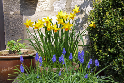
Contrasting colours add interest and boost the colour saturation in the eye of the viewer.
In this picture the yellow of the daffodils contrasts with the bluebells and each colour intensifies the other. Placing the yellow and blue in separate horizontal blocks helps generate balance that is more pleasing to the eye.
Placing the horizon
Thirds
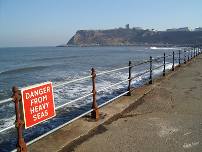
There are many sources of information that tell the photographer that the best place for the horizon is on one of the two imaginary horizontal lines that divide the picture into thirds. It is true that many photographs I have taken do seem to conform to this convention such as the picture of Scarborough seafront below.
In the Scarborough photograph the horizon is placed on the imaginary line that defines the upper third of the picture (two-thirds from the bottom) and all is well. This picture was not taken with this explicitly in mind at the time, it just felt natural for this compostion.
Adding more interest
The ‘comfort’ of having the horizon on the two-thirds line is balanced by the dynamic diagonal lead-in formed by the railings and walkway that takes the viewer to the extreme left of the picture before the eye is led back across to the bottom of the cliff where it meets the sea.
A subconscious emotional journey is taken through the picture with the viewer being led right out of the frame by the diagonal before being brought back to rest on the horizon line where order is restored at the intersection of the horizontal and vertical thirds.
It is my belief that we all share an understanding of the ‘rightness’ of this placement because we are surrounded by images and designed objects that use this composition element.
This immersion has given us all a visual literacy so we may respond positively to a picture that employs this technique without being aware of why.
Using the Lead-in
Lead-ins are a composition technique I use a great deal. For me the purpose of a lead-in is to draw the viewer into the picture by guiding the eye. In a landscape context our eyes look to the ground so we know where it is safe to walk. Placing a lead-in in the bottom foreground of the picture plays to this fact and is a strong cue for the viewer to start to examine the image from a familiar perspective and you are led into the picture.
This structure feels familiar and allows the viewer to navigate the rest of the picture. Composition is therefore about understanding and evolving patterns that help guide the viewer through the image and engaging the viewer’s attention.
Let’s look at a picture that seems completely different:
I still think of this as a landscape picture, (I’m interested in what you think so please do leave a comment). This is a less conventional image, the only familiar reference point is the sky. There is nowhere to imagine yourself walking in this picture so I felt less constrained to have the lead-in in just one place. Now the lead-in lines dominate the picture radiating inwards from all the edges and command the attention to the crown in the middle top. Once the eye has lingered there it moves to the background and the familiarity provided by the blue sky and white clouds. The interpretation then moves from abstract pattern to some structure that is in the open air, a construction in the landscape.


